Graphic Design MMXXIII
"Counter Culture" font


A designer knows he has achieved perfection not when there is nothing left to add, but when
there is nothing left to take away.
-Antoine de Saint-Exupery
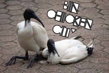
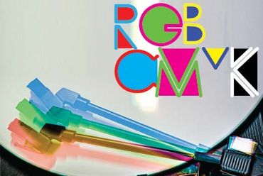
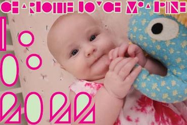
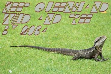
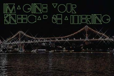
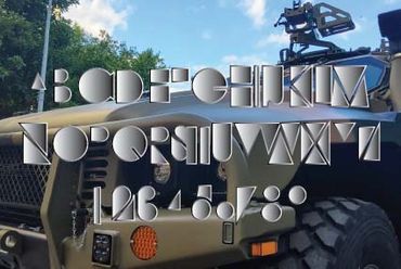
Banner Design:
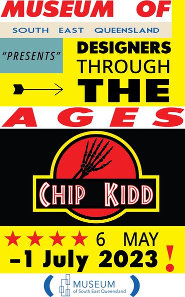
Typograpy Mural

Once I decided on a quote it was a matter of balance; my muse for this project was Sharon Tate. Taking under consideration the source of the quote, I wanted something slightly unhinged.
Those things considered, I wanted a psychadelic 1960’s aesthetic.
My favourite tools are envelope warp, gradient & polar grid and I got to use all 3.
After feedback I toned down the amount of gradients and the colours in use, this opened the window to use one of my favourite colour combo’s.
I had trouble finding a relevant image to do my effect but I was more focused on the actual effect so I acquired a copyleft photo from a protest, broke it into layers (Illustrator could barely function with the amount of data on my first attempt so I had to scale backthe amount of lines & letters)
Logo Design: Food Branding


Location Rebrand: Moscow


Print Design - Magazine Spread

The title for my spread, “Behind The Paint” was adopted from the title of the biography of rap duo Insane Clown Posse frontman Violent J (and their song of the same name)
This article was full of challenges as a novice to InDesign & Illustrator at the time, upon reflection researching & creating the body copy was easy in comparison. I want
The title for my spread, “Behind The Paint” was adopted from the title of the biography of rap duo Insane Clown Posse frontman Violent J (and their song of the same name)
This article was full of challenges as a novice to InDesign & Illustrator at the time, upon reflection researching & creating the body copy was easy in comparison. I wanted illustrations but for the sake of functionality I didn’t want to trigger anybody with said phobia so I took the opportunity to illustrate some clowns using basic lines, shapes and flat colours.
The clowns on the first spread are variations of freestyling while learning the software, from there I looked up other relevant historical or pop culture icons:
ICP’s Shaggy 2 Dope and Violent J (J unfortunately didn’t make the final spread)
John Wayne Gacy (Murderer)
Ronald McDonald (Fast Food Mascot)
Weary Willie (Clown based on the hobos of the great depression)
Shawn Crahan (SlipKnot [Percussion]) &
Captain Spaulding (House of 1000 Corpses)
Font choices; I wanted to explore outside the Avant Garde type family and opted for clean & legible, which was a stark contrast to my headline font: Jokerman. My thought process behind using the forbidden font was that this article was in fact about clowns and was therefore functional in that right. Also something about knowing the rules so you can break them properly. I was ordered to at least change the subheading from Jokerman to DIN Black as the use of Jokerman was overpowering as is,
I ultimately agreed with this decision.

Coulrophobia

Violent J (Insane Clown Posse)
Captain Spaulding (House of 1000 Corpses)
Violent J (Insane Clown Posse)

Pogo (John Wayne Gacy)
Captain Spaulding (House of 1000 Corpses)
Violent J (Insane Clown Posse)

Captain Spaulding (House of 1000 Corpses)
Captain Spaulding (House of 1000 Corpses)
Captain Spaulding (House of 1000 Corpses)

Shaun Crahan (SlipKnot)
Emmett Kelly [Weary Willie} (clown based off the hobos of the great depression)
Captain Spaulding (House of 1000 Corpses)

Emmett Kelly [Weary Willie} (clown based off the hobos of the great depression)
Emmett Kelly [Weary Willie} (clown based off the hobos of the great depression)
Emmett Kelly [Weary Willie} (clown based off the hobos of the great depression)
